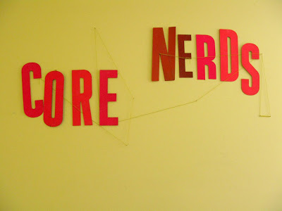
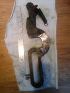
nerdy

Cards and Experiments

:: the tricky little lock-up ::

I printed some new business cards for myself last week. To save money, I set the card on wood and metal type instead of getting a polymer plate and printed the cards on scraps I had gathered from previous projects. Setting the type and getting the composition just right took some time, but the printing was quick and easy. I switched colors a few times for variety. To make them more versatile I trimmed them long and narrow so that they can double as bookmarks and price labels for books as well. 

:: done and done ::

I also did some polymer plate experiments on my Chandler & Price, Junior. So far, I've only printed wood and metal type on it. Polymer is a little fussier and I was worried the results wouldn't be so great. I set up a variety of plates, a halftone, a block of large text, and another much finer lined text. Not bad at all, these aren't even the recommended deep relief polymer plates. 

:: nice ::

:: very nice ::

:: little over inked, but nice! ::

That's a relief. Good job little C&P. 

Like Tears in Rain...

I printed a letterpress broadside with the famous tears in rain quote from the movie Blade Runner. I am now queen of the nerds.


:: like tears in rain ::

The type is handset 8 pt Univers Italic, set in a straight line across the lower half of the print. Every time I pulled a print, I wiped the ink off of the last part of the text, "time to die" so that it would print lighter than the rest.


:: all wood and metal type and forms ::

The rest of the print was composed entirely from wood and metal type and forms (big blocks of wood) that were available where I work, at Common Press of The University of Pennsylvania.


:: type and wood block ::

Each print is cranked through the press one color at a time and one piece of paper at a time, so that's ten layers of color and text on every print. It makes some interesting and unexpected textures and colors when those layers meet.


:: type and wood block ::

The prints will be available soon from an edition of 15.

Thoughts on Books

Yesterday, I had a particularly good day at the used bookstore and came home with a heavy stack of books. Looking at them made me wonder, how can you replace books with screens?

In my opinion, you can't. A book is to be enjoyed for its design as well as the information it contains and unlike a screen, it ages, often in beautiful and unexpected ways.

perfect tape

This is Cape Light, a book of photographs by Joel Meyerowitz. It's one of the first photography books I fell in love with.

catchy title

I have always wanted to get more acquainted with minerals.

These reproductions of crystals are so lovely.

In 6th grade, I think I was the only kid psyched to go on a geology field trip, which included going to a quarry, checking out some strata, and looking at core samples collected by geologists. It was awesome. I should have been a scientist.

The Boy Mechanic

Lastly, do you ever have the sinking feeling we're getting worse at doing things? All things? If not, you haven't yet read "The Boy Mechanic," a collection of 800 projects a boy should be able to do, such as weave a hammock, build a canoe, or build your own homemade electric locomotive model and track system.

Now how do you feel? Yeah, I thought so.

I love books. I love them as objects and for what they contain. I never want to live in a house without books. I can't even imagine what that would be like. Maybe books will end up like records, no longer mass market but still enjoyed by a small group of loyal enthusiasts. We'll see.

Here I am.

:: little scraps ::

I feel like I've been holed up for weeks, there's so much to do. Making things, looking for things, watching things...

Many new books, and other projects in various stages.

:: hardcover books in progress ::

I was very happy to look in the mailbox a the other day to find some mail from my friend Beth, including an erratum to add to my collection. Thank you, Beth!

:: Oh Beth, you know me well, greenland, erratum, and birds... ::

:: studio ::

Basically, spending a great deal of time working in the studio and at home. Already starting to miss the cozy feeling of winter.

InPRESStigator!™

You know what? Fixing a press is not easy, especially if you're unfamiliar with the inner workings of the type of press you're trying to fix. I've used Vandercooks for years, and feel confident tinkering with one, because I know how it's supposed to act when it's working. But this press...

my press where it sat for 30 years unused

Is a riddle wrapped in an enigma wrapped in a vest. Recently though, I've made some more progress, and more importantly, I'm gaining confidence. I'm also coming to terms with the fact that this press will never look perfect, but it should work.

A few months ago, I found out that my press has some parts that weren't manufactured by Chandler & Price.

my press, ink disc bracket

My ink disc bracket is made up of three parts, two arms that bolt to the frame and one that lays over top, like a post and lintel. On a C&P, this is all one piece.


my press, ink disc lever

Another mystery was how come the ink disc lever, the mechanism with a little hook that turns the ink disc, was much smaller than a C&P's. It worked, it just didn't look like it was supposed to.

Lastly, there's the gripper cam.

my press, gripper cam

A C&P's gripper cam

Well, as you can see, one of these things is not like the other. I knew these parts weren't homemade repairs, because they had serial numbers on them, but I didn't understand where they could have come from.

So I did some research and found out that around 1887, Chandler & Price was not the only press manufacturer around. There were many regional manufacturers building nearly identical generic presses lumped under the description of old style Gordon jobber presses. The article George Gordon's Dream Press is a great resource if you want to learn more. I plan to buy A Catalogue of 19th Century Printing Presses by Harold E. Sterne when I have some extra dollars too.

Now that I knew that, I searched for images of "gordon jobber presses" and started finding some presses that had parts that looked like mine! Like this one, an S&L old style jobber press with a three piece ink disc bracket.

three piece ink disc bracket

And most striking, I found the Old Reliable. The Old Reliable was only manufactured for one year, 1888, and then the patents were sold to Chandler & Price.

Old Reliable

Chandler & Price Old Style

The two press's look nearly identical! So what I've come to realize is that my press is a mutt. The main frame and platen is from a 1887 Chandler & Price. The flywheel, gripper cam, ink lever, and ink disc bracket...not Chandler & Price. They could be from any number of regional press manufacturers that were around back then. I'm so glad I figured this out, because now that I know that there's plenty of other mystery presses out there that are working. Will it work even though it's a mutt? I think so.

Field Trip!


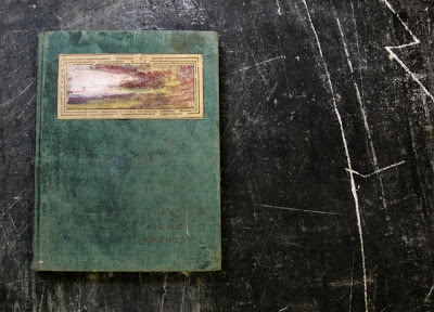
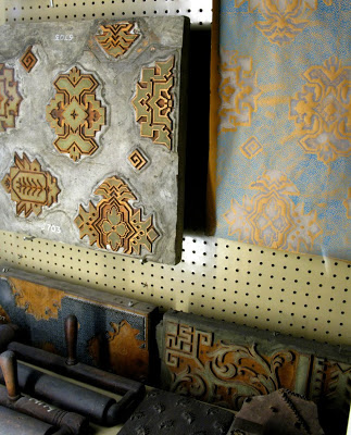
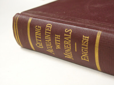
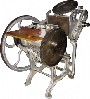
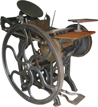
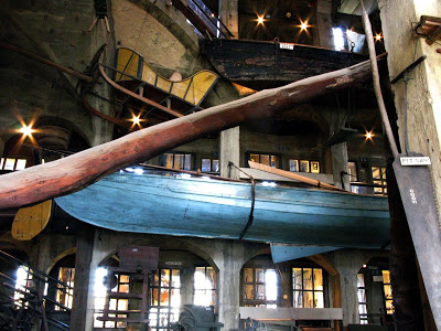
Last week, Mike and I decided to go to the Mercer Museum, a collection of pre-industrial revolution tools and objects, in Doylestown, PA. There are many things that make this museum a unique place, one being the building itself, which is best described as a spiraling, concrete castle.

It's also a charming time capsule of a long lost museum exhibition style. Each exhibit in its own little room, behind paned glass, with description...Is that peg board?

the wallpaper maker's room: handcarved wooden blocks

that tag says "obsolete objects circa 1991"

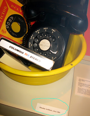
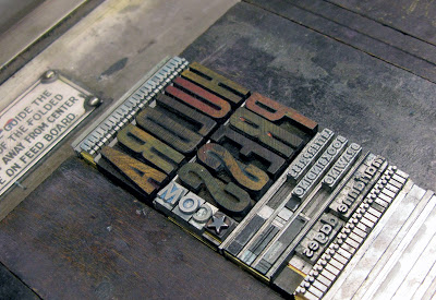
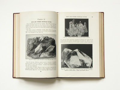
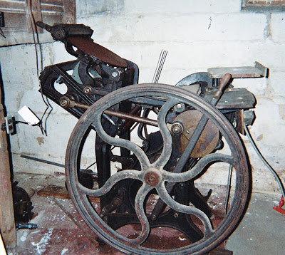
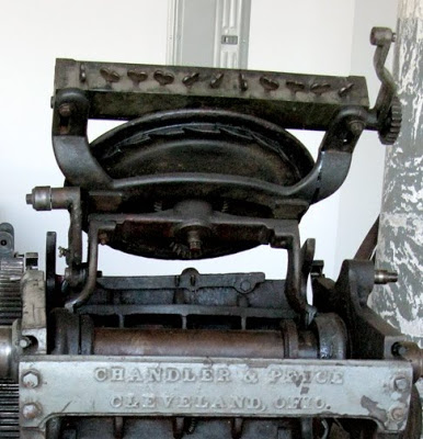
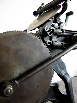
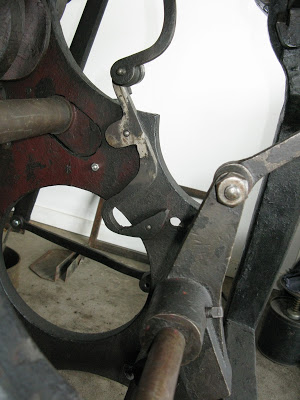
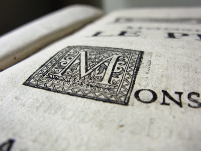
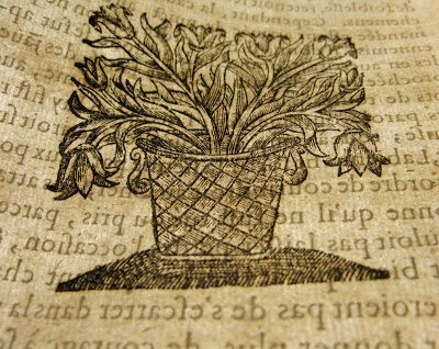
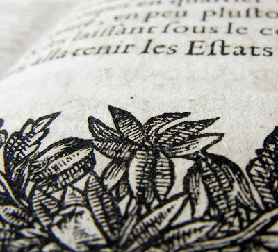
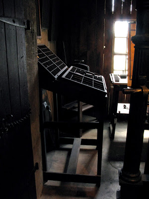
And there was a letterpress room! Complete with iron hand press, and lovely little cabinets.

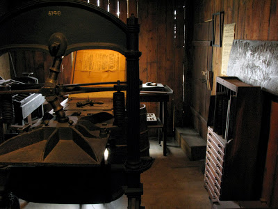
Needless to say, we were filled with nerdy delight to see all these tools, Mike being a blacksmith, and I a fan of obsessive collections of obsolete objects (see Henry Ford). Great field trip day.


So.


There are time tested hallowed traditions one must follow while a Core Fellow. As per these traditions, I have moved out of my studio and bedroom at Penland to make way for a new group of Core Fellows, and left huge piles of crap in my wake.

I don't really like saying goodbye. It's hard and yucky and awkward and sometimes you have to do it twice or three times which is even worse. But it has to be done. So.

Goodbye studio.

Goodbye witty light switch.

And goodbye dearest, sweetest nerds. I will miss you all so much.

bwahahahaaa

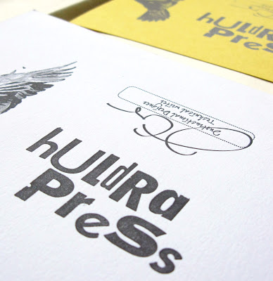
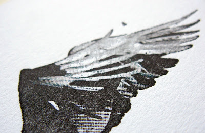
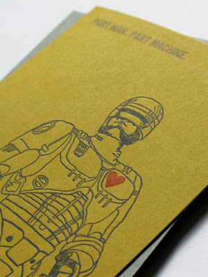
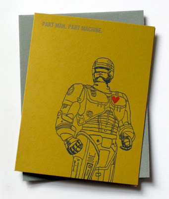
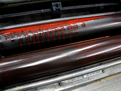
Printing was just murder today... HA! I did print a whole bunch of new cards that I'll be taking pictures of soon. Feathers, wrens, hellos, congrats, thank you''s, more robocops! Lots of new things.

My boyfriend and I also got the stomach flu, luckily offset by two days so there was no competition for bathroom territory. This was an experience I wish on no one. No one. I spent most of Thursday night curled up on the bathroom floor reading Nintendo Power, which is perfect reading material for coming in and out of consciousness. Tough questions, real answers.
Like this one,

Q: If you could play your Nintendo anywhere, where would it be?
A: I would play it on a mountain of money so then I could buy more Nintendo games after!

Awesome! Thank goodness we're both feeling great now. So great...why...It makes me want to SING!
(thank you, Henry, for this video)

A Resolution

This year, inspired by my very organized and talented friend, Amy Tavern, I made the resolution that I would start keeping meticulous record of all my expenses (and profits) related to letterpress and bookbinding.
To motivate myself, I shopped on Etsy today for a handmade pouch to keep receipts. I love vintage fabrics, especially wools and plaids, and found these lovely examples of using recycled wools.


I went with the last one, although I covet them all.

But what I really covet? A lot? Is one of these.

Katie Henry, from Philly, makes these beautiful one of a kind purses, and if you're real lucky, you'll snag one from her madebyhank etsy shop.

I want one real bad.

That's all for now. It's snowing here, and it looks it will continue to snow through the night. I'm going to go watch V now. Good times.

Rave to the Grave, y'all...


Poster by Jason Burnett

Halloween is tomorrow. Here at Penland, this is kind of a big deal. We have a party and everyone dresses up in handmade costumes. So far I've heard whisperings that a paint by numbers cat, a half polar bear half bridesmaid, and Brian Wilson will be attending.

Jason Burnett of Cakeboy Industries made this fantastic silkscreen poster featuring local legendary blacksmith Elizabeth Brim (with a leatherface mask) wielding a chainsaw. So tomorrow, Jason and I will be cutting up trash bags and splattering fake blood everywhere to set the mood. The theme is "rave to the grave" so get ready to do just that.

If you're in the area, there will a contest for best costume and the Scream Queen and King will be crowned. And yes, prizes will be awarded!

A couple years ago, I went as a Ghostbuster.

the beer in the pocket is a nice touch

This year, I will be once again mining a classic early 80's piece of film, this time Scanners. I'm not cool enough to be Darryl Revok so I'll be Kim Obrist, the female character in the movie.
So if you see someone dressed as a drab Canadian with a touch of grey and a nosebleed, that's me. Happy Halloween!


A show, a press, and a giant floating stone head


It's been a little while, hasn't it? I've been busy, getting ready for the Core Show and so have all my dear colleagues. There's still framing to be done, but yesterday I finished my new deluxe business cards, so things are moving along. It's getting there.

There's also big news on the horizon...

Saturday, I'm picking up my new press, a 10 x 15 Chandler & Price. I'll post pictures after the move. A real bargain basement find. Literally. It's in a basement and yes, it's really a bargain. So this week, I'm gathering my wits and resources for the move. Any advice?

I know the press will need some work, but I'm beginning to feel like things are coming together. I have a hard time moving forward when I don't know what's coming next. Getting this press is making the future more concrete. A thousand pounds more concrete.

Oh, and I'm looking forward to watching Zardoz.


A Very Old Book: Les Commentaires De Cesar


You know how people say,
this is why we can't have nice things? Well this is my nice thing, and knock on wood, I haven't ruined it, and I'm good at ruining nice things. It's incredible, I'm very capable of delivering neat, precise work to others but terrible at caring for my own possessions. I don't know. It's weird.

I've had this book for a very long time. It belonged to my great-grandfather. My great-grandfather was an academic and historian in France. I remember standing in his library in Aix-en-Provence and being told I could pick out one book and I picked this, the oldest looking book on the shelf. It dates from 1658.

Now that I make books, it's become a much more interesting object to me and the damage that seemed so unfortunate fortunately reveals the structure of the binding. So although I am no expert, I will tell you what I know of how this book was made.

To bind this book, the pages were sewn onto double raised cords that were then threaded through the front and back covers which were then covered in leather. They are called raised because you can see them bulging through the leather on the spine.

On the top of the book are endbands sewn over top a paper core. Two alternating colored threads were wrapped over the core for a decorative effect. The back of the book is lined with used parchment. Parchment was a valuable material and old manuscripts, this one handwritten, were taken apart and used again when no longer useful.

This is truly one of my favorite things about books, seeing how materials were reused and how much character it adds to the object.

At this time, all paper was made in a manner that we consider 'handmade' today and such paper was made from linen or cotton rags, no longer usable as clothing but very valuable to the papermaker. The paper is full of textures and inclusions that could be considered imperfections, but it has lasted almost four hundred years. That's right copy paper, four hundred years.

the texture of laid mould handmade paper

This book also has beautiful printing, sprinkled with ornamentation and maps


My family is from France and the quantity of, well, very old things is so much greater there than here and these very old things are passed on or trashed with a nonchalance that is jarring to an American like me. They are just not that exceptional over there. But I guess that makes me lucky. My family thought this book made an acceptable gift to an 8 year old and that's pretty great for me. Vive la France.

blue beautiful blue


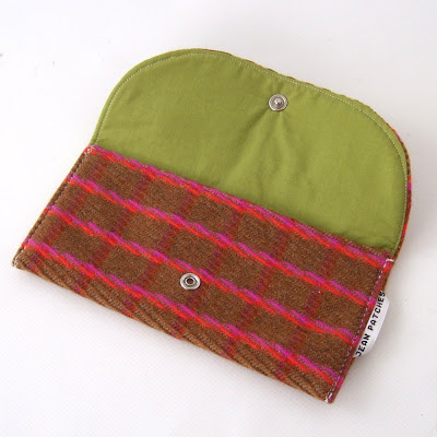
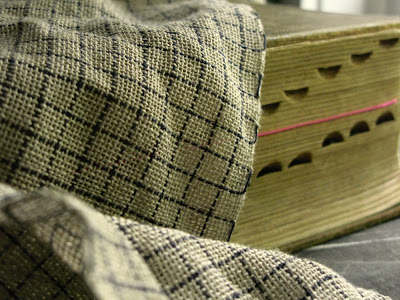
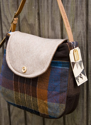
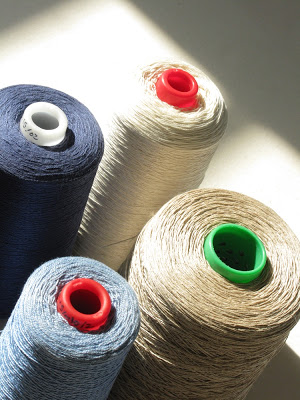
My color of the moment seems to be blue. Grey blues, indigo blues, navy blues. For my last class of the summer, I took a weaving class with Janet Taylor, a textile artist and weaver. She makes beautiful work, and I must say, is one the sweetest, most generous teachers I've ever had. It was such a perfect way to end the summer...

In that class, I wove a scarf to look like graph paper. What originally inspired this project was a Shaker kerchief I saw in a book that was a simple grid pattern woven out of fine linen.

graph paper scarf :: handwoven linen and cotton

I did some weaving in college and enjoyed it, but never felt I made anything with a personal look to it. As simple as it is, I feel like this scarf does just that. I hope to spend more time in the weaving studio this winter.

Around the same time as I was making the scarf, my friend Erika also asked me if I would make a book using graph paper and goats. I think this is the most fun commission I've ever been asked to do. So good! I'm working on it right now and I'll give you a sneak peek in process.

in progress case bound book

And lastly, I saw this incredible mushroom while walking home yesterday, and I identified it. Done and done.

an indigo milky mushroom

My oh Mycology


I took some pictures of these incredible mushrooms today, coincidentally, a day after buying the National Audubon Society Field Guide to Mushrooms. I grew up with this book around the house, which I found fascinating because of its glossy black pages and images of strange fungi. It's a beautiful book, slim and tall with dark brown plastic covers. When I go for walks, I love looking for mushroom. Strange little creatures that appear like magic, poking their heads out of the wet leaves after a good rain.

These mushroom are huge by the way. The pinkish white one (chicken of the woods I believe) is about two feet across and the orange one (jack o ' lantern I think) is about three feet.

I'll also share with you some pictures of another field guide to mushrooms soon. It has the most wonderful color palette. I'll also show you some of the weaving I just made... Inspired by graph paper!

Summer is over, so there will be more time to talk about all these wonderful things.


Rab and His Friends

Rab and His Friends is a slim, 5.5" x 4.5" volume of stories by Dr. John Brown. It starts interestingly enough, "Four-and thirty years ago, Bob Ainslie and I were coming up Infirmary Street from the High School, or heads together, and our arms intertwisted, as only lovers and boys knows how, or why..." but really I haven't read further than that. The reason for this is I bought this book for it's cover. So it's a fact, people judge books by their covers. Take that, content.

It is a lovely cover, made of teal book cloth with a long, rectangular window and the title plainly gold-stamped in the lower right hand corner. What I found especially beautiful about this book was how the image in the window had been worn away to abstraction.


The first title page is so humble, just the title of the book printed crookedly in black ink. Rab and His Friends. That's it.


The second page is a more traditional decorative title page printed in red and green. These pages as well as the rest of the book were so obviously hand printed that I decided to try to research the book on the internet. Soon enough, I found an entire web page devoted to the work of the Henry Altemus Company, the publishers of this edition.


And get this, they are from Philadelphia, my dearly missed home. It was pretty fascinating to the read the history of the company and to recognize so many addresses. I like to imagine what Philadelphia was like when it was a more industrialized place, and so many more things were being made right there in the city. There are some great examples of advertising ephemera on the Henry Altemus Web Site. I recommend checking it out if you feel like geeking out on what it was like to be a publishing company in the 1800-1900's. I know I did!


And ladies. Do yourself a favor and pick this one up. It's witty, it's philosophical, it's full of sound sense in concentrated lozenges, need I say more? I don't think so.