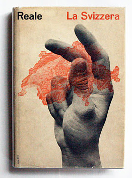
Yesterday, I had a particularly good day at the used bookstore and came home with a heavy stack of books. Looking at them made me wonder, how can you replace books with screens?
In my opinion, you can't. A book is to be enjoyed for its design as well as the information it contains and unlike a screen, it ages, often in beautiful and unexpected ways.
perfect tape
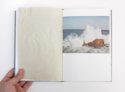
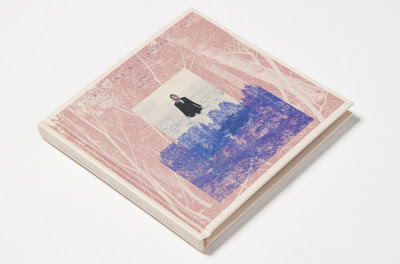
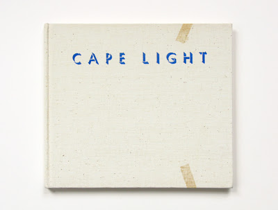
This is Cape Light, a book of photographs by Joel Meyerowitz. It's one of the first photography books I fell in love with.
catchy title
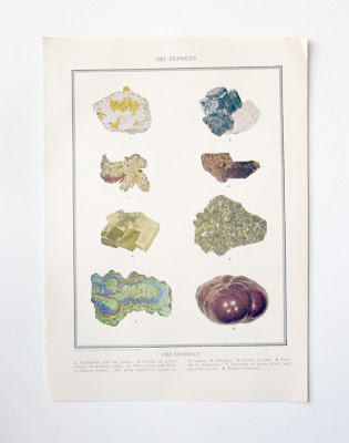
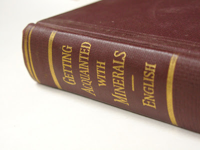
I have always wanted to get more acquainted with minerals.
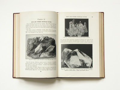
These reproductions of crystals are so lovely.
In 6th grade, I think I was the only kid psyched to go on a geology field trip, which included going to a quarry, checking out some strata, and looking at core samples collected by geologists. It was awesome. I should have been a scientist.
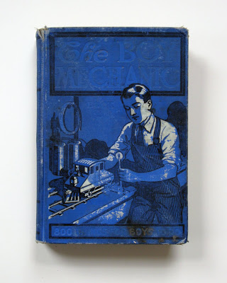
The Boy Mechanic
Lastly, do you ever have the sinking feeling we're getting worse at doing things? All things? If not, you haven't yet read "The Boy Mechanic," a collection of 800 projects a boy should be able to do, such as weave a hammock, build a canoe, or build your own homemade electric locomotive model and track system.

Now how do you feel? Yeah, I thought so.
I love books. I love them as objects and for what they contain. I never want to live in a house without books. I can't even imagine what that would be like. Maybe books will end up like records, no longer mass market but still enjoyed by a small group of loyal enthusiasts. We'll see.
 :: ocean ::
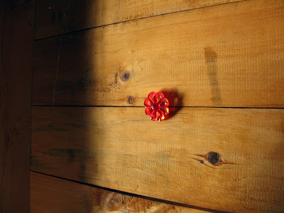 :: in the boat house ::
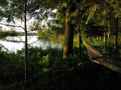 :: hammock ::
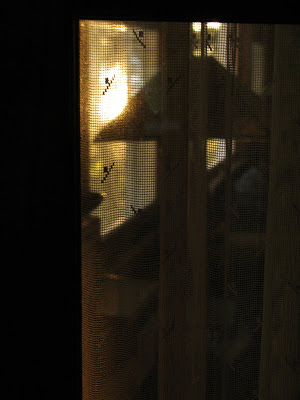 :: lamp and curtains ::